Raven and friends

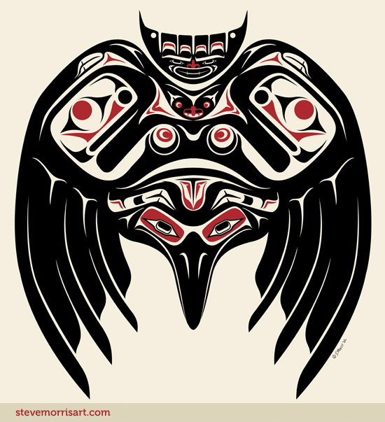
This was one of the original Salish style images that I made in early 2000, I think this was actually the last one that I created. Recently, I did further editing to it by adding the color red (was originally all black) as well as adding a bat (directly below his tail). Represented, aside from the Raven itself, is a frog, a bat, two turtles and a human.

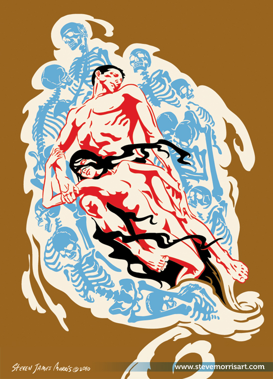
Paolo & Francesca finished art

Title: "Vertiginous Our Love"

Finishing this "Paolo & Francesca" piece, just cleaning up some of the shapes now.

Paolo & Francesca were historical contemporaries of Dante and appeared in his "inferno," more info here and here. The couple has appeared in many works of art over the centuries, inspired by their characterization in the "inferno".

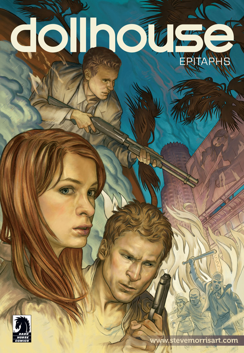
Dollhouse comic cover

Info on the Dollhouse comic adaptation was just released in the last day or so. I created this cover shortly after I did the "Serenity: The Shepherd's Tale" cover. This isn't being released as an individual comic but is being bundled with the Dollhouse season 2 dvd release. More info here .  Having been a fan of both Serenity and Dollhouse, I was really excited about providing art for their comic incarnations.

In the works

Over that last four days I've been progressing in a new cover for Dark Horse. I also have a licensing deal, with a retailer,which developed over that last month or so. Unfortunately I can't say much more about either project, for the time being, but I'll fill in the details when I can.

Dendriform Fig. 1 sketch

This is a detail from my new series, "Dendriform", which will contrast the synthetic-modern world with the natural world. The style will be more editorial than my regular digital paintings and I'll probably be using a  restricted palette. I also want to introduce some old experiments from college, specifically geometry and the human body.

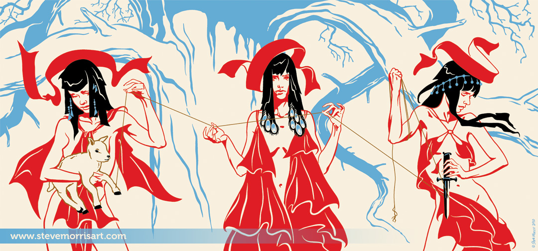
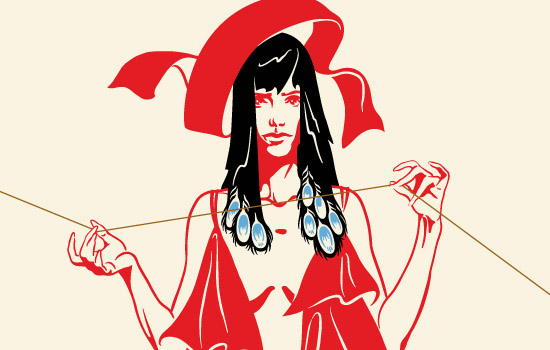
Norns Final Illustration

Title: "A Trembled Thread Through Our Hands"

I thought I could get away with breaking this into three images, but after experimenting, I decided that breaking up the thread wasn't working...so I'll be selling this print as one 15"x7" image rather than three 5"x7"s

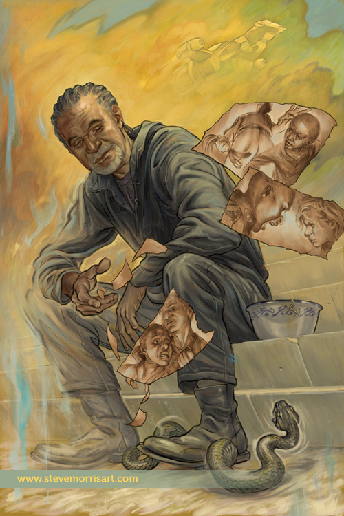
Serenity Graphic Novel Cover

One of the covers I recently created, has been released to the general public. The above image is for a Serenity graphic novel (published by Dark Horse Comics)  called, The Shepherd's Tale. The focus of this story is Shepherd Book, a character from Joss Whedon's TV series Firefly. For  more information about the GN you can read about it at Comic Book Resources here.

The Norns Sketch

I've been head deep in another job, specifically a comic book cover, which I can't say much about right now, but it's kept me from getting any personal work done. Before the cover, I had started sketching out a new triptych for Butterbroda with a depiction of The Norns.  The Norns (similar to The Fates), are three maiden giantesses who decide the fates of men through their judicious twinning, measuring and cutting of the tread of fate, of each individual. I've drawn them standing in front of the World Tree (Yggdrasill), which is the blue squiggles in the back. Hopefully I'll be able to get started on this during the weekend.

Likenesses

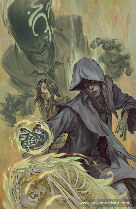
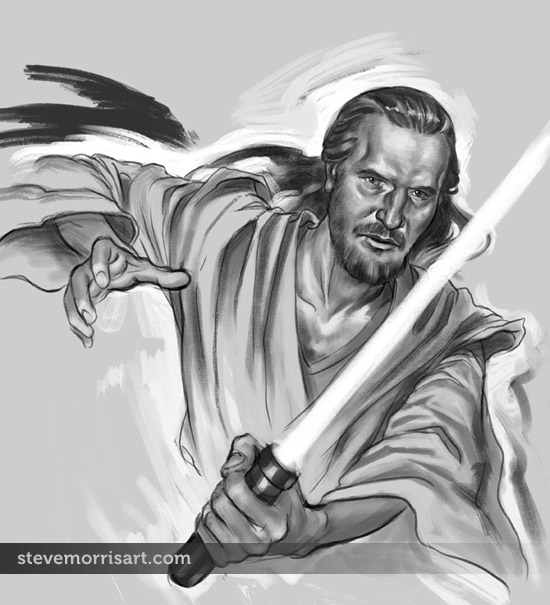
These Qui Gon Jinn and Buffy sketches (click the "continue reading" link to see the Buffy sketch) are a result of a potential client, requesting that I provide examples to demonstrate my ability to create a likeness accurately.
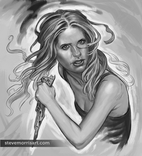
I noticed this page was getting allot of hits so I updated the above image as I had edited it after posting...my roughs are rough, but the older one had been too rough for Dark Horse so I had smoothed it out.

I don't like to copy images, for many reasons, but creatively it narrows what you can do with the character as you must always match the body pose to what face angle you can find...I much prefer doing whatever pose I want and then extrapolating the face from several photos. I've painted portraits throughout my life, so I guess if I have a "thing", faces would be it, and this background is a big benefit to do likenesses and faces in general.

These sketches landed me the job and I'll fill in the details once the work is published.
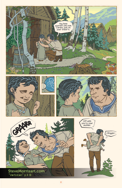
"Verboten" graphic novel, page 3

I converted another page of my GN "Verboten" from the Butterbroda style to this more colorful style. I haven't yet applied the Photoshop gradients,  like I have for the first page...which will help add depth and atmosphere. Converting a page from the old style to the new, is more time consuming that I thought it would be, because of the time it takes to muddle through the Illustrator file...I'll be curious to see how long a page takes once I start new pages. Working on the pages in the Butterbroda style was like assembling  a jigsaw puzzle because the limited color pallet greatly restricts how shapes can overlap and be placed, it's nice to be freed from that.

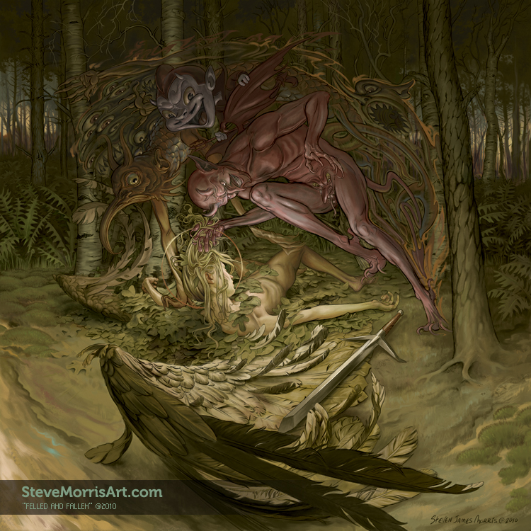
“Felled and Fallen” color final

This is the final image, for the time being, I'll go back to it in a couple of weeks just to see if I want to add any other details or define anything better. I had posted the first "finished" version at ConceptArt and the general feedback was that the angel's position was too hard to figure out under a pile of leaves, so I removed almost all the leaves, moved her leg and added an arm.