"Felled and Fallen" color WIP.1

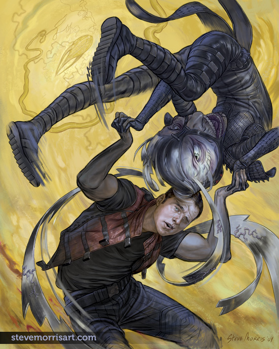
I've started coloring "Felled". I've reverted back to a less green tinted version from the detail above. The green tint was added to help bring more focus to the angel's face (with the contrasting color), but I liked the slightly more muted tone of the original...I can always tint at the end if I decide to go back in that direction. The picture is about 40% finished, in terms of adding color detail and rendering, I also want to paint over more of the line art. I keep intending on doing some more simple pictures (this was suppose to be one of those) but they end up getting more complicated despite my original intention.

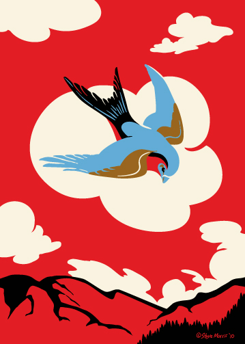
Flipping the bird

I flipped the colors on this one, it started with the lighter pallet , but I felt it was getting a little lost...at least in the present composition. This is part of the "Westerly Strut" sub-series, but it could really go with Butterbroda "proper" as well. On a side note, I've started to color the "Felled" drawing,  it still has along ways to go, but will post the WIP soon.

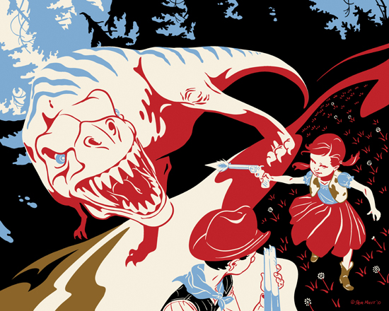
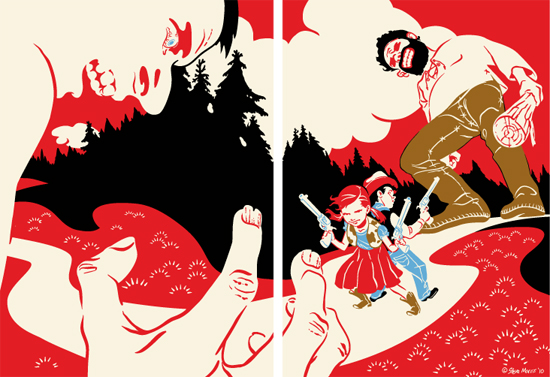
Prairie Iguana

Title: Negotiating the Prairie Iguana

Originally this was meant to be a diptych,like the other I had done. Aside from liking triptych and diptych, there was also a practicality angle (in terms of shipping) bc I have the materials for shipping 5"x7" prints, but not 8"x10". But I decided that breaking the images into two halves doesn't work for the flow of the composition. So I reformatted this as well as "We Shall Pop A Cap" to 8"x10". I'll likely have these printed on a glossy stock as it provides scratch protection, which these bigger prints may need. Once they're under glass, the difference in surface finishing to the 5"x7" becomes a non issue.

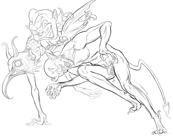
Devil Totem

Title: "All of Me, 1k"

Back in early 2000 I did several Salish style animal pictures, I sold them on shirts a bit, but the designs have pretty much been shelved for a long time. Recently, I thought about trying to work some of that Salish style into my present work, either in "spirit" or more literally.  I sketched out this new piece a few weeks ago, and yesterday I finally dove and got it done. The fun part about using the Salish style is that I normally have the larger encompassing figure planned out, but after that part is drawn I wing it, carving shapes into the larger outline and then experimenting with what types of figures work in the voids and spaces.

Felled and Fallen WIP.2.5 (the devils)

Update 02/12/10—Finished devils grouping. I'm also close to finished with the entire drawing itself, I just need to do a little shading.

02/06/10—I've started work on the "devils" portion of this piece, a few more devils are still to be added to the mix...the end goal is to have a mass of devils which visually appear as an arch over the angel. Most of them will be rendered so that they appear relatively ghostly against the background, except for the central devil which is holding the angle's hair.

"Devil's Rodeo"

Title: Better Adversity's Burden, than Beast

The devil and cowboy are from the CD art, with some very minor edits and the additional background added. I find myself making the backgrounds on this sub-series lighter than "Butterbroda" proper...not sure why that is, but I'm sticking to it.

"Devil's Rodeo" is a song title from the album "The Sporting Life" by Diamanda Galás and John Paul Jones (bass, Led Zeppelin). The album was released in the early 90's and was one of my favorites back then and I still listen to it from time to time. The music is comprised of Galás (vocals), Jones (bass), drums and occasional piano and organ. Instrumentally,  the sound is driven by the bass, which sometimes takes on tones of Morphine (circa "Cure for Pain")...I always enjoy when bass takes the forefront. Galás provides uncompromising vocals which morph between the sound of voice and instrument. Give her a listen:

Just Spotted

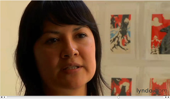
A friend of mine contacted me today and let me know that he saw some of my prints in a video at Lynda.com. The video is of the talented creative team Mexopolis (Jorge Gutierrez and Sandra Equihua) who create the  cartoon series El Tigre. The prints only appear on screen briefly, it took me a few views of the video to catch them. I think that clip of the video may have have been shot in the Subtext gallery in San Diego.  You can view the full video here if you didn't click on the "video" link above.

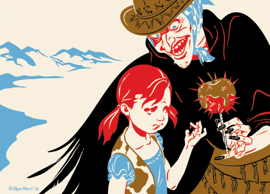
Strangers with Ouchie Candy

Title: "Shared Evaluations oft not Share Appreciations"

Another from the Westerly sub-series. The girl and candy apple originally appeared on the CD art, with the apple being held by a hand which came in from the edge of the liner note page. I redrew the hand and added the witch. The visual suggestion of a wing, on the witch's right side, was added for a little more weirdness...I had played with putting her other arm there, but it seemed distracting...the wing was more subtle and added a component to the story telling.

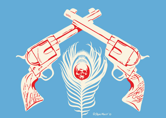
More from the West

Title: "Our Intentions  Carved a Path of Rave and Ruin"

Another for the Butterbroda—Westerly Strut sub series. Originally I created this for the "Chasing Giants" CD, but it was sidelined  for another pict. The colors were in a different combo, and I swapped out the cream background for a solid blue to make the silhouettes of the guns stand out.

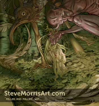
Felled and Fallen WIP

I was getting ready to start coloring another of my older drawings but decided that it was a little boring. Originally the picture was a wooded scene with an arm, sword and wing emerging from a covering of leaves. I intended it to be tranquil, albeit a picture of a dead angel, but I decided I wanted a livelier image. I've increased the original wing size as well as revealing the angels head, which will be held up by a devil. I'd prefer not to cover up the background details, with the devil, but the foreground is the main focus, so I'm still experimenting.

RTX Art Color Final

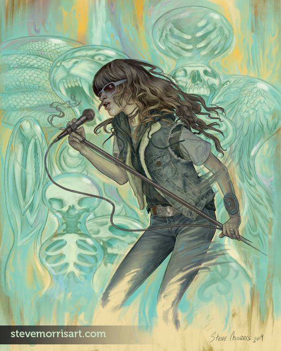
I've started coloring some of my older drawings. I had time during the week and finished this  RTX ( Jennifer Herrema ) piece. I may add some animal tails (raccoon, fox...) to her ensemble, but haven't as of yet bc I felt they may interfere with her silhouette. I planned on rougher brush strokes a la Boldini, but the amount of background detail in this pict required more restraint...Instead I did some marbling in the bg but left it vague.  Originally I was going to use an ochre/yellow background but since I want to use that color scheme on my Farscape drawing, I changed plans on this one.

Dethklok Digital Painting WIP updated with final art

Above is the tentatively finished piece, any changes will be minor and probably visible only on the hires file.

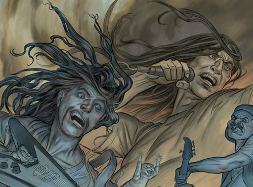
Detail of the WIP. I still have plenty to do, the color is all down, but I'm busy refining and rendering...and in some cases, editing the drawing, like Murderface's head.

dethklok_color_v1

This is the start to the coloring to my Dethklok drawing. The sky is close to finished,  Nathan still has some work to be done, but I'll wait until I can get the rest of the picture blocked out so I can get a better overall sense of things. I also need to figure out how to handle the jaguar above Nathan, I may end up deleting it if it doesn't blend well with the rest of the picture.

Dog Portrait Paintings

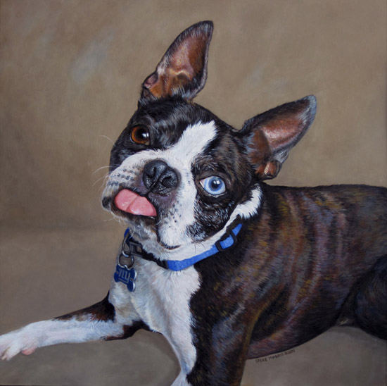
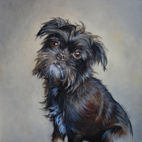
These are the photos of the dog portraits which I was commissioned to paint, last month.  The original photos I was given were soft in areas, but I was able to use secondary photos of the same breeds to fill in the gaps of detail. Both portraits are painted with acrylic on Strathmore 500 series illustration board, the boston terrier is 15"x15" and the griffon mix is 13"x13".

Dethklok drawing WIP updated 12/12

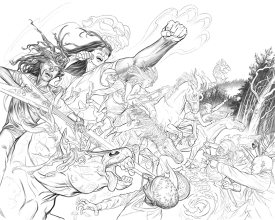
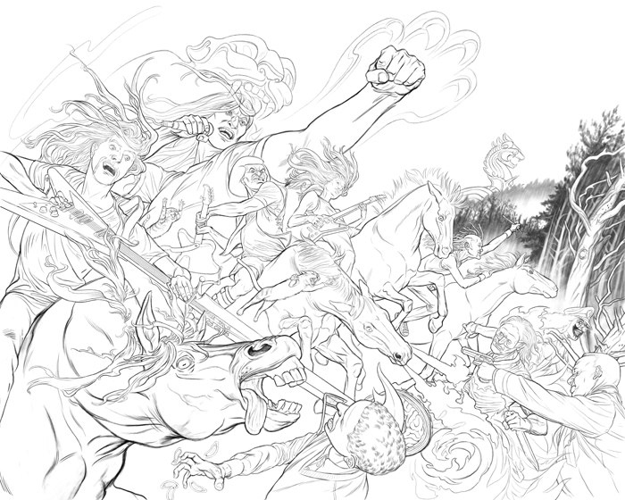
dethklok_pencils_2sm I'm finally back to working on my personal projects. This is the final drawing with the altered horses and various touch-ups, I'll start on the coloring from here and do any other altering during that stage. I did a minimal amount of shading to the figures, since this piece, unlike the gripping beast picture, is less about dense rendering and more about the overall flow.
dethklok_draw06

Another update, about 10% remaining to do to the drawing, most of which is editing the horses to reflect famine, death, pestilence and war imagery of the four horsemen. Click image above for larger version.dethklok_draw02
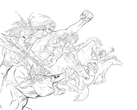
I've gotten all the main Dethklok characters drawn, next I'll start working on all the peripheral imagery as well as tweaking the existing line work.
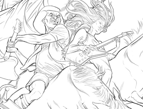
dethklok_draw03

Above is a close up...I just noticed that I forgot Skwisgaar's guitar strap. I also need to print it out to get an idea of the scale and whether any more detail is needed.
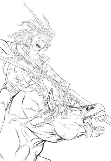
dethklok_draw01

This is the first section of finished pencils from the Dethklok sketch, specifically the lower left corner, which is Toki. I plan on doing extra shading later on, once I'm sure that all the parts of the picture are where I want them to be.  This part of the drawing will probably be the hardest part bc of the unusual angle on the horse and the guitar...the rest of the drawing is more straight forward though, and I'll hopefully burn through it faster. I'll be adding all future updates, for this drawing, within this post.

See the final art here.
The Bouncer

51TKGQP6JFL._SS500_ For anyone interested in wild west centric comics or really beautiful art, check out The Bouncer by Alexandro Jodorowsky and Francois Boucq.  The graphic novel series is comprised of two large format books centered around betrayals, murder and greed. I originally picked them up years ago because I was really taken in by Francois Boucq's sweeping illustrations. I don't think I've ever seen an artist with such a cinematic feel to their work. Not only are his landscape expansive, but even his indoor scenes can take on a larger-than-life dimension, while making the reader feel as though they are right in the middle of the action. The story itself will keep you engaged and its often brutal vision of life in the Old West will certainly make you think twice about longing for those simpler days.

Painting

I received a commission to do two pet portrait paintings last week, so the work flow for my WIPs has come to a standstill for the time being...but I hope to get back to them next week. I hadn't needed to buy paint in a while and discovered the Grumbacher is no longer making professional grade acrylics, at least based on the price and the name "Academy Acrylic" I don't think they are really professional grade. These days, local stores seem to mostly carry Liquitex acrylics, which I only buy in certain colors, I find some of their paint to have an odd consistency. So it looks like I'll need to switch to Windsor and Newton or Utrech brand and just order paint online. Strathmore's 500 series heavyweight plate finish boards also proved to be difficult to hunt down in stores, although I found a good price on a small box of them online so that worked out.

Dethklok Illustration WIP

dethklok_sketch I was planning on coloring one of my older drawings this past weekend, but then an idea came to mind and I started this Dethklok pict. For anyone unaware, Dethklok is a fictional band in the cartoon, "Metalocalypse", on Adult Swim. The pict above is a piece of the sketch and what I'll start dropping my  final pencils over.  The concept: Nathan as a jaguar god, of sorts, and the other band members will be the four horsemen...I may even add some "kitties". It basically combines a traditional "Revelations" apocalypse with a little 2012 Mayan flavor, to help push the imagery further.
See final art here.

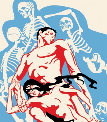
Paolo & Francesca WIP

paolo&Franch3_5x7 The above detail was started a while back and is very much unfinished...I open it up from time to time to fiddle, adjust and move it forward. Paolo & Francesca are characters (as well as historical figures) in Dante's Inferno. The couple inhabit a whirlwind of souls condemned for their carnal lust. I don't specifically remember why I started this image, but I imagine I came a cross one of the many painted renditions of the subject during some random net surfing. I may tone down the skeletons, by either simplifying them or stylizing them...or both.