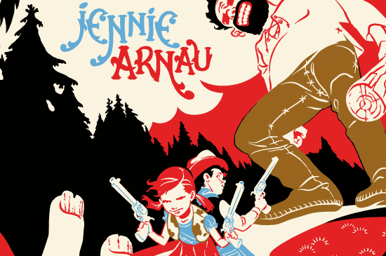
Graphic Novel Art
 This has been in the works for a while, or rather was started a while back but progress has come to a stand still because of other projects and work. Above is the first page of a very long Graphic Novel I wrote, set in Medieval Northern Europe. I originally planned on doing the GN in my Butterbroda style because it fit the subject matter, and a simple style would speed up the drawing process...although that style is deceptive and takes more work than even I seem to realize sometimes.
I completed the first four pages, but the general consensus said it wouldn't work over an entire book. I was really determined to make the style work, but admittedly wasn't really sure myself, that it would hold up over 300 pages...so after allot of mental ping pong I went in the direction of the image above...a mix of Butterbroda with some Russian and Japanese influences added.
The desire to use the Butterbroda style was fulfilled when I started the print series...and any lingering heistation about using the more rendered style for the GN dissipated. Now I just need to get on with it...
 This is the final colored gripping beast picture. The full size is 18"x18" at 600DPI, it was a good thing I bought this new machine, my old Mac wouldn't have been cable of handle this large of a file. I'm debating if I need to add some more highlights to the skeletons in the beast's body but I want to see some test prints before I do any more.
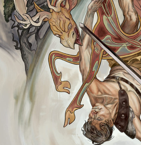 I've finally gotten around to the coloring process on the older drawings I did. This is a part of the Gripping Best image. I'm still experimenting some with the color but the overall I've been happy with the painting effect that I've been able to make in PS. The beast itself has the most work left on it. I changed some small parts of the background for better flow to the picture.
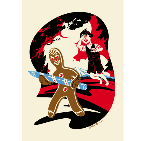 Title: "Our Indulgences are Not Without Defense"
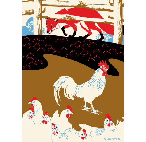 This is the final Fox ill. titled, "Kings Who Rule Less Challenged, In Springs are Bright, but Winters May They Fade?" I also started another pict last night, which I was able to get pretty far along with...will post soon.
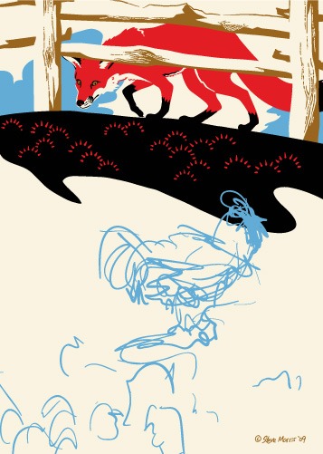
 Here's the finished ill. Now I just need to come up with a title.
 With all the Halloween imagery floating around I decided to fiddle with an old bat illustration I did, years ago, that was done in a vintage holiday decoration style. But I decided to apply the bat theme to a new Butterbroda image and the picture above is a result of what I did today. I wasn't planning on having a background, allowing the boys shape to only be defined by the outline of the bat, but I changed my mind. I'm still fiddling with this though, should have it done by the end of the week.
 I finally found some time this weekend and was able to finish the gripping beast picture. More background texture will be added during the coloring.


 This is a new drawing, as yet unfinished, of a warrior in battle with a gripping beast. The "gripping beast" is part of the "Oseberg style" of art, originating in Scandinavia circa 800 AD.
 I've been in the slow process of redoing my old portfolio site, I plan on removing the iframes and keeping everything contained on one page using css sliders and lightbox (or one of the other light___ apps). The image posted above is a piece of the art for the new-main interface that will run along the top of the page. Work has been busy lately so I haven't been able to draw as much as I'd like, but I've started a new drawing that I'll post a WIP of in a few days.
 This is another from the group of new drawings I'm working on. I had originally planned on creating a straight forward picture of the cast from
  This is the final drawing to the WIP, with the creature totems finished in the background. The coloring stage will help to separate the foreground from the background and some further editing to the drawing may occur as I color.

 Over the last several years most of my artwork has been focused on sequential storytelling, and I was doing very little stand-alone images. Last year I started creating the red and black colored image series, as an offshoot of a style I had started to use for a graphic novel.