Painting on the floor

This is a 12+ years old self portrait, that needed a some finishing and fixing...at this point the main part that needs to be cleaned up is the shirt. I'm using the foil to protect the painting surface from hand oils.

I've always painted on the floor, mainly because I like to spread out, but also because I want quick access to all my paint tubes, due to the fast drying acrylics on the pallet. I decided to crack open my unused liquid acrylics along with my tubes. I've never used fluid acrylics for painting, but they definitely make life easier in some cases...they do dry-up really fast though, in comparison to the Winsor & Newton tubes, which have some retarder mixed in with them.

New sequential art

So this happened over the weekend...

This is for a story I wrote in 2006. I wanted to use a new style, and had experimented some but never got past that stage. Recently, I started working on the story again and came to the conclusion that I would be better off partnering with an artist (other than myself). I came to this conclusion mainly because I thought it was better time management...but in the last week the control freak in me began surfacing so I start to experiment again with the newish style. Once I had done a few pieces, I made an impromptu dive into the art for page one. Part of me would prefer the style to be more exaggerated, a little less real, but this direction seems to be working so any alterations will likely be small. I also have a page two which is almost done.

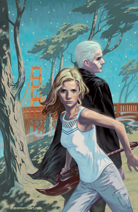
Cover for Buffy the Vampire Slayer, vol. 1, season 9

This image is a newer version than what’s being used for the solicitations, but this is the image that will be used on the printed cover. The first covers for the Buffy and A&F volumes needed to be done quickly, so it wasn't until after I turned in the Buffy vol1 cover that I saw the issues with it. Luckily I was able to go back and improve it before press time.

Buffy The Vampire Slayer cover Season 10 Issue 8

My cover for Buffy Season 10 issue 8, due in October 2014. Produced in a style showcasing my love of vintage Halloween ephemera.

The cover for issue 8 was already finished when Dark Horse told me they were doing a Halloween themed issue for 8. So we shifted the finished cover to another issue and I got to work on the new one. I pitched the idea of doing a very retro wraparound piece, based on the style of old Halloween decorations...past experience has proven that they'll go out on a limb, and this time was no exception.

Along with the stylized coloring, I also created an effect to mimic registration mistakes with the yellow and brown ink plates. The last piece of the puzzle was adding a rough paper texture over the top, which brought the image to life by adding a tactile tooth.

Buffy the Vampire Slayer Season 10 Issue 7

This cover has a bit of a story. I wanted to get some SF landmarks into the background so I searched through various streets views, and decided on a street which had the Trans American Pyramid in view and the Columbus Tower in the middleground. After turning the cover in, DH contacted me with concerns that were brought up about using the buildings. Most landmark buildings have rules about how/if they can be used in works of art/film/photography etc. So to play it safe the pyramid received a redesign and the tower was made-over.  I'll be sticking to state/federally owned landmarks from now on lol.