Written by Steve Morris
On
In Project Updates
Tagged art, butterbroda, Fates, illustration, mythology, Norns, Steve Morris, steven james morris, women
Serenity Graphic Novel Cover
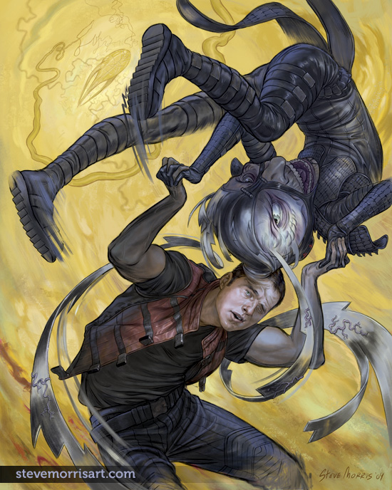
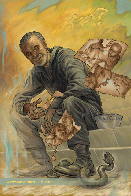 One of the covers I recently created, has been released to the general public. The above image is for a Serenity graphic novel (published by Dark Horse Comics) called, The Shepherd's Tale. The focus of this story is Shepherd Book, a character from Joss Whedon's TV series Firefly. For more information about the GN you can read about it at Comic Book Resources here.
The Norns Sketch
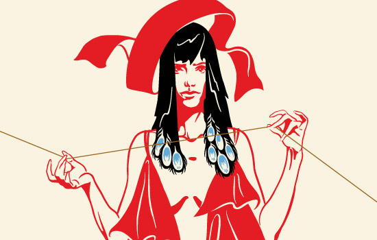
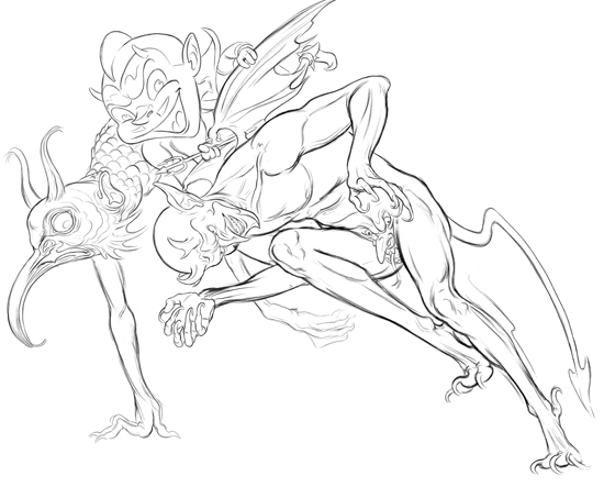
 I've been head deep in another job, specifically a comic book cover, which I can't say much about right now, but it's kept me from getting any personal work done. Before the cover, I had started sketching out a new triptych for Butterbroda with a depiction of The Norns. The Norns (similar to The Fates), are three maiden giantesses who decide the fates of men through their judicious twinning, measuring and cutting of the tread of fate, of each individual. I've drawn them standing in front of the World Tree (Yggdrasill), which is the blue squiggles in the back. Hopefully I'll be able to get started on this during the weekend.
Likenesses
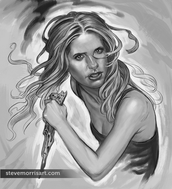
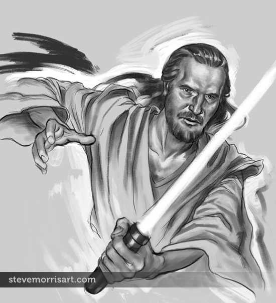 These Qui Gon Jinn and Buffy sketches (click the "continue reading" link to see the Buffy sketch) are a result of a potential client, requesting that I provide examples to demonstrate my ability to create a likeness accurately.
I noticed this page was getting allot of hits so I updated the above image as I had edited it after posting...my roughs are rough, but the older one had been too rough for Dark Horse so I had smoothed it out.
I don't like to copy images, for many reasons, but creatively it narrows what you can do with the character as you must always match the body pose to what face angle you can find...I much prefer doing whatever pose I want and then extrapolating the face from several photos. I've painted portraits throughout my life, so I guess if I have a "thing", faces would be it, and this background is a big benefit to do likenesses and faces in general.
These sketches landed me the job and I'll fill in the details once the work is published.
"Verboten" graphic novel, page 3
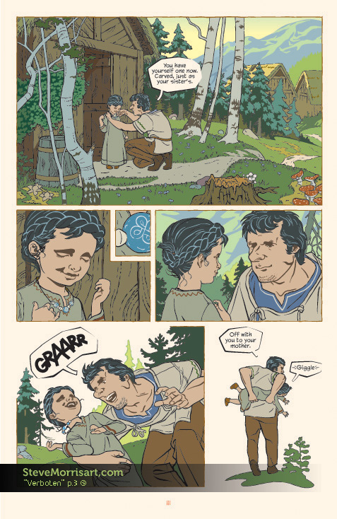 I converted another page of my GN "Verboten" from the Butterbroda style to this more colorful style. I haven't yet applied the Photoshop gradients, like I have for the first page...which will help add depth and atmosphere. Converting a page from the old style to the new, is more time consuming that I thought it would be, because of the time it takes to muddle through the Illustrator file...I'll be curious to see how long a page takes once I start new pages. Working on the pages in the Butterbroda style was like assembling a jigsaw puzzle because the limited color pallet greatly restricts how shapes can overlap and be placed, it's nice to be freed from that.
“Felled and Fallen” color final
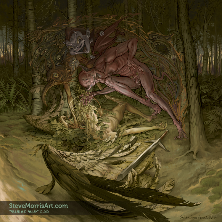 This is the final image, for the time being, I'll go back to it in a couple of weeks just to see if I want to add any other details or define anything better. I had posted the first "finished" version at ConceptArt and the general feedback was that the angel's position was too hard to figure out under a pile of leaves, so I removed almost all the leaves, moved her leg and added an arm.
"Felled and Fallen" color WIP.1
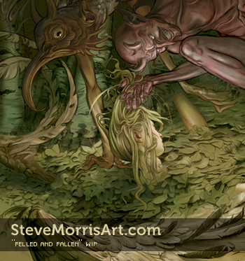 I've started coloring "Felled". I've reverted back to a less green tinted version from the detail above. The green tint was added to help bring more focus to the angel's face (with the contrasting color), but I liked the slightly more muted tone of the original...I can always tint at the end if I decide to go back in that direction. The picture is about 40% finished, in terms of adding color detail and rendering, I also want to paint over more of the line art. I keep intending on doing some more simple pictures (this was suppose to be one of those) but they end up getting more complicated despite my original intention.
Flipping the bird
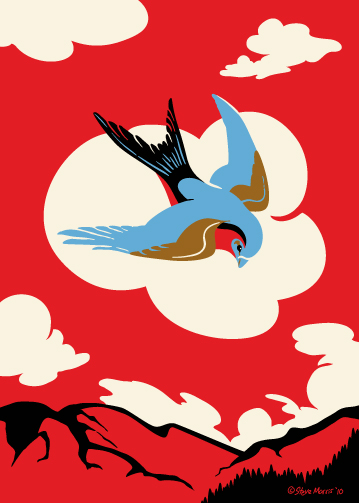 I flipped the colors on this one, it started with the lighter pallet , but I felt it was getting a little lost...at least in the present composition. This is part of the "Westerly Strut" sub-series, but it could really go with Butterbroda "proper" as well. On a side note, I've started to color the "Felled" drawing, it still has along ways to go, but will post the WIP soon.
Prairie Iguana
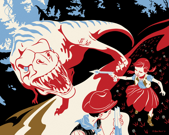 Title: Negotiating the Prairie Iguana
Originally this was meant to be a diptych,like the other I had done. Aside from liking triptych and diptych, there was also a practicality angle (in terms of shipping) bc I have the materials for shipping 5"x7" prints, but not 8"x10". But I decided that breaking the images into two halves doesn't work for the flow of the composition. So I reformatted this as well as "We Shall Pop A Cap" to 8"x10". I'll likely have these printed on a glossy stock as it provides scratch protection, which these bigger prints may need. Once they're under glass, the difference in surface finishing to the 5"x7" becomes a non issue.
Devil Totem
Back in early 2000 I did several Salish style animal pictures, I sold them on shirts a bit, but the designs have pretty much been shelved for a long time. Recently, I thought about trying to work some of that Salish style into my present work, either in "spirit" or more literally. I sketched out this new piece a few weeks ago, and yesterday I finally dove and got it done. The fun part about using the Salish style is that I normally have the larger encompassing figure planned out, but after that part is drawn I wing it, carving shapes into the larger outline and then experimenting with what types of figures work in the voids and spaces.
Felled and Fallen WIP.2.5 (the devils)
 Update 02/12/10—Finished devils grouping. I'm also close to finished with the entire drawing itself, I just need to do a little shading.
02/06/10—I've started work on the "devils" portion of this piece, a few more devils are still to be added to the mix...the end goal is to have a mass of devils which visually appear as an arch over the angel. Most of them will be rendered so that they appear relatively ghostly against the background, except for the central devil which is holding the angle's hair.
"Devil's Rodeo"
 Title: Better Adversity's Burden, than Beast
The devil and cowboy are from the CD art, with some very minor edits and the additional background added. I find myself making the backgrounds on this sub-series lighter than "Butterbroda" proper...not sure why that is, but I'm sticking to it.
"Devil's Rodeo" is a song title from the album "The Sporting Life" by Diamanda Galás and John Paul Jones (bass, Led Zeppelin). The album was released in the early 90's and was one of my favorites back then and I still listen to it from time to time. The music is comprised of Galás (vocals), Jones (bass), drums and occasional piano and organ. Instrumentally, the sound is driven by the bass, which sometimes takes on tones of Morphine (circa "Cure for Pain")...I always enjoy when bass takes the forefront. Galás provides uncompromising vocals which morph between the sound of voice and instrument. Give her a listen:
Strangers with Ouchie Candy
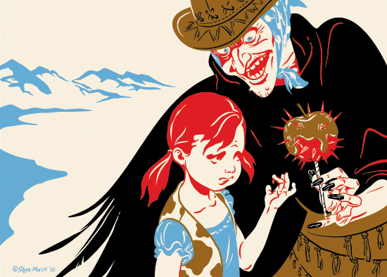 Title: "Shared Evaluations oft not Share Appreciations"
Another from the Westerly sub-series. The girl and candy apple originally appeared on the CD art, with the apple being held by a hand which came in from the edge of the liner note page. I redrew the hand and added the witch. The visual suggestion of a wing, on the witch's right side, was added for a little more weirdness...I had played with putting her other arm there, but it seemed distracting...the wing was more subtle and added a component to the story telling.
More from the West
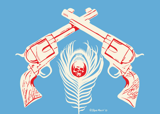 Title: "Our Intentions Carved a Path of Rave and Ruin"
Another for the Butterbroda—Westerly Strut sub series. Originally I created this for the "Chasing Giants" CD, but it was sidelined for another pict. The colors were in a different combo, and I swapped out the cream background for a solid blue to make the silhouettes of the guns stand out.
Butterbroda-Westerly Strut
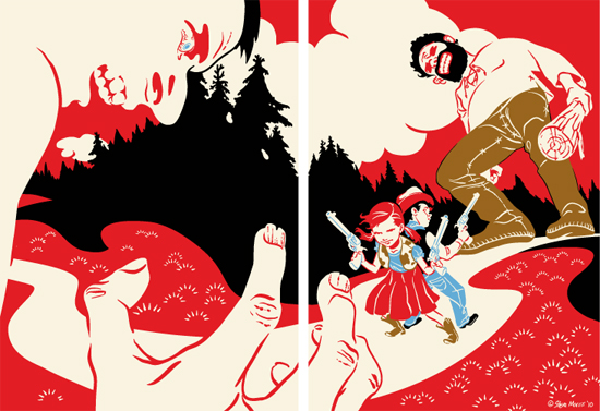 I planning on using some of the CD packing art I had created and using them in a sub-series for Butterbroda of western themed pictures. The first is a dyptic of two 5"x7" panels titled, "We Shall Pop a Cap". I hope to have ten or twelve image when I'm done, but may add more if the ideas keep coming.
Felled and Fallen WIP
 I was getting ready to start coloring another of my older drawings but decided that it was a little boring. Originally the picture was a wooded scene with an arm, sword and wing emerging from a covering of leaves. I intended it to be tranquil, albeit a picture of a dead angel, but I decided I wanted a livelier image. I've increased the original wing size as well as revealing the angels head, which will be held up by a devil. I'd prefer not to cover up the background details, with the devil, but the foreground is the main focus, so I'm still experimenting.
RTX Art Color Final
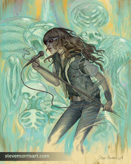 I've started coloring some of my older drawings. I had time during the week and finished this RTX ( Jennifer Herrema ) piece. I may add some animal tails (raccoon, fox...) to her ensemble, but haven't as of yet bc I felt they may interfere with her silhouette. I planned on rougher brush strokes a la Boldini, but the amount of background detail in this pict required more restraint...Instead I did some marbling in the bg but left it vague. Originally I was going to use an ochre/yellow background but since I want to use that color scheme on my Farscape drawing, I changed plans on this one.
Dethklok Digital Painting WIP updated with final art
 Above is the tentatively finished piece, any changes will be minor and probably visible only on the hires file.
Detail of the WIP. I still have plenty to do, the color is all down, but I'm busy refining and rendering...and in some cases, editing the drawing, like Murderface's head.

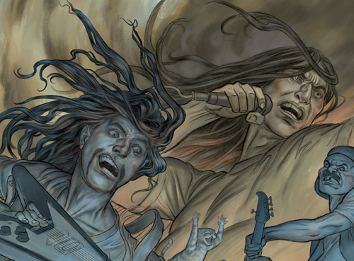
This is the start to the coloring to my Dethklok drawing. The sky is close to finished, Nathan still has some work to be done, but I'll wait until I can get the rest of the picture blocked out so I can get a better overall sense of things. I also need to figure out how to handle the jaguar above Nathan, I may end up deleting it if it doesn't blend well with the rest of the picture.
Dog Portrait Paintings
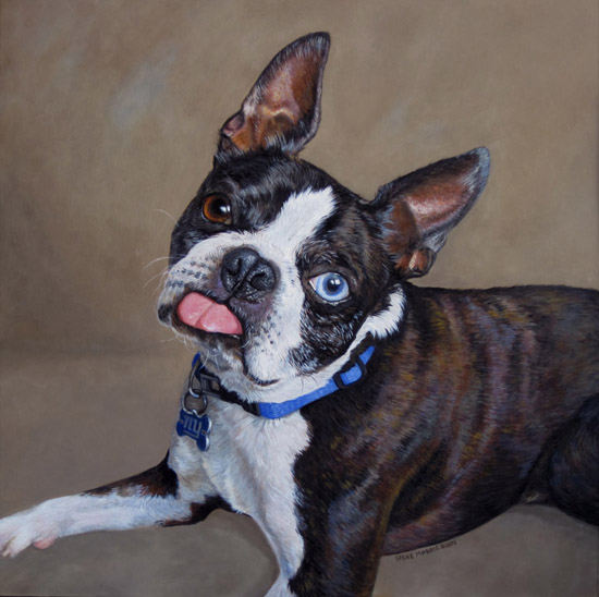
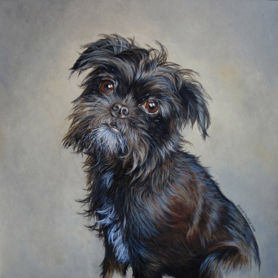
These are the photos of the dog portraits which I was commissioned to paint, last month. The original photos I was given were soft in areas, but I was able to use secondary photos of the same breeds to fill in the gaps of detail. Both portraits are painted with acrylic on Strathmore 500 series illustration board, the boston terrier is 15"x15" and the griffon mix is 13"x13".
